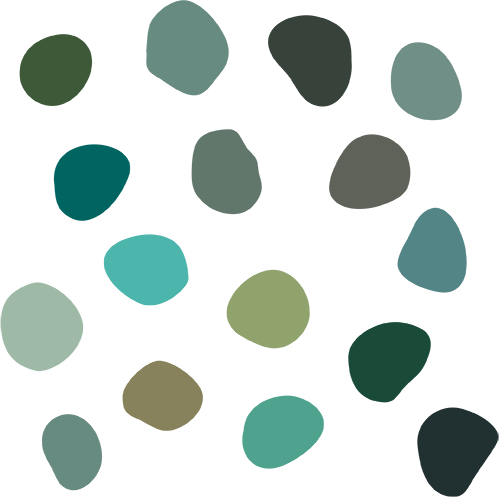
As we welcome Spring and renewal, many of us are reaffirming our goals to achieve a better balance between work and play, between mental and physical health, or between economic and environmental interests. These aspirations also are reflected in the colors trending in residential remodeling and home construction.
1. Shades of green
 Regrowth, new life and resiliency are communicated in shades of green. As a unifying color solidly in the middle of the visible color spectrum, green represents balance better than any other hue. Because the light waves that produce green are easy for our eyes to perceive, it can be calming and reinvigorating at the same time.
Reminiscent of nature, green can subconsciously center our minds and promote wellness. Muted pale grayish greens have broad appeal and add an airy quality without sacrificing a sense of warmth.
2. Warm neutrals
Welcoming and familiar, more earth tones, such as terra cottas, clays, warm grays and rich browns, are providing a suitable canvas to spotlight what’s most important in our spaces and our lives. Look for these to pair with natural, tactile materials for enhanced equilibrium and immersive comfort.
Establishing visual harmony with the surrounding environment, darker neutrals on exteriors are balanced with lighter shades on interior spaces. Even as classic black continues to gain appeal inside and out, we’re noticing more dark warm grays like washed-out charcoal and brownish soot.
3. Natural blues
Bluish grays add an optimistic, wistful element to the neutrals. Natural blues bring a freshness evocative of seas and rivers, often including a greenish tint to dilute the intense coolness that blue normally exudes. A rich, deep blue pops against a quiet neutral background, luxuriously elevating biophilic architectural details, such as wood grain finishes.
4. Coppery oranges
Even with home trends focusing on comfort and warmth, yellows and oranges appear sparingly in desert-themed tones. Coppery oranges and honey yellows offer a gentle impact color that preserves the perceived balance, providing a fortifying presence.
5. Peaceful purples
Other bold colors similarly are dialed down to create more peaceful surroundings. As examples, red colors skew brownish instead of intense crimson, and pinks are muted and floral. Instead of electric violet, purple tends toward grayish lilac and lavender.
Color choices can affect our mood and our behavior. We hope these trends help create harmonious, grounding spaces that inspire balance and stability.
